| Founded | 1963 |
| Headquarters | Sant’Agata Bolognese, Italy |
| Founder | Ferruccio Lamborghini |
| Parent Company | Audi AG (a subsidiary of the Volkswagen Group) |
| Products | Luxury sports cars, SUVs |
| Popular Models | Aventador, Huracán, Urus, Gallardo |
| Website | www.lamborghini.com |
In the automotive world, logos often play a vital role in establishing a brand’s identity. Among them, the Lamborghini logo is particularly distinctive, with its raging bull symbol and an assertive color scheme. But where did this iconic emblem originate, and what does it signify?
This article dives into the captivating history and meaning of Lamborghini’s logo, appealing to car enthusiasts interested in the stories behind the design.
Lamborghini Symbol Meaning: What Animal is on the Lamborghini Logo?
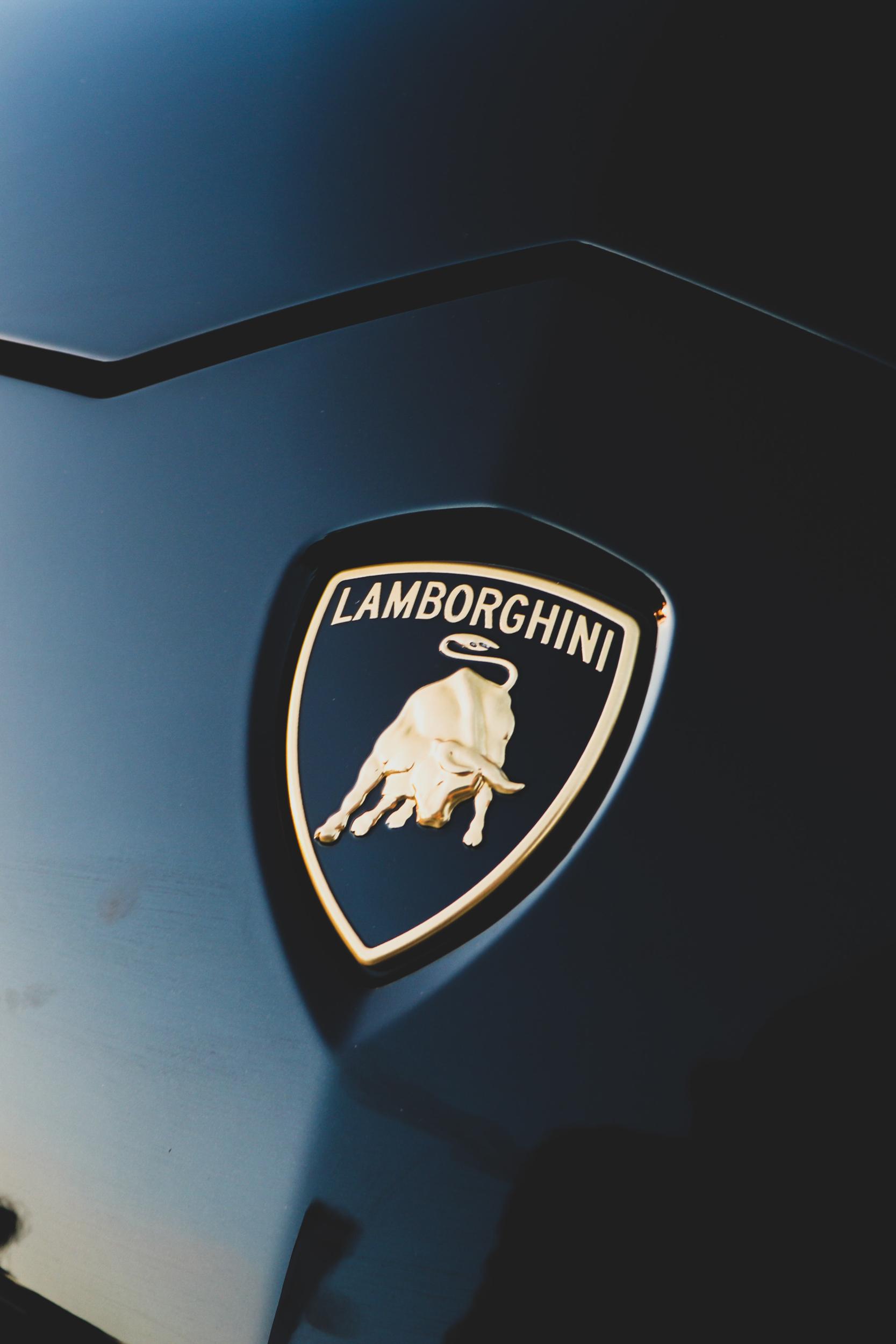
The presence of a raging bull in the Lamborghini logo is a fascinating symbol with several layers of meaning. This emblem is not only a representation of strength, power, and aggression but also an intricate part of Ferruccio Lamborghini’s life.
The bull symbol, chosen purposefully, is aligned with Ferruccio’s zodiac sign, Taurus, a star sign known for its connection with determination and strength. Lamborghini’s fascination with the bull further deepened after a visit to the Sevilla ranch in Spain, where he witnessed the majesty of the Spanish fighting bulls. This experience moved him to such an extent that it became a key inspiration for the emblem that is now synonymous with the brand.
Moreover, the choice of the bull symbolizes the ferocious power under the hood of Lamborghini cars. It reflects a design philosophy that focuses on performance, speed, and unbridled energy, capturing the very essence of what Lamborghini aims to deliver in its automotive creations.
But the bull is not just a symbol of raw power; it also speaks to the brand’s commitment to perfection and innovation. The relentless nature of a charging bull mirrors Lamborghini’s determination to push boundaries and continually raise the bar in automotive excellence.
Lamborghini Symbol History
The logo of Lamborghini has seen a remarkable evolution, reflecting the company’s growth, transformation, and enduring commitment to excellence.
1953 – 1963

The Lamborghini emblem’s inception came at a time when Ferruccio Lamborghini was primarily involved in the manufacturing of tractors. During these early years, the logo was fundamentally different from the iconic symbol we recognize today. It carried a more industrial aesthetic without the emblematic bull, more indicative of the agricultural focus of the brand.
1963 – 1972
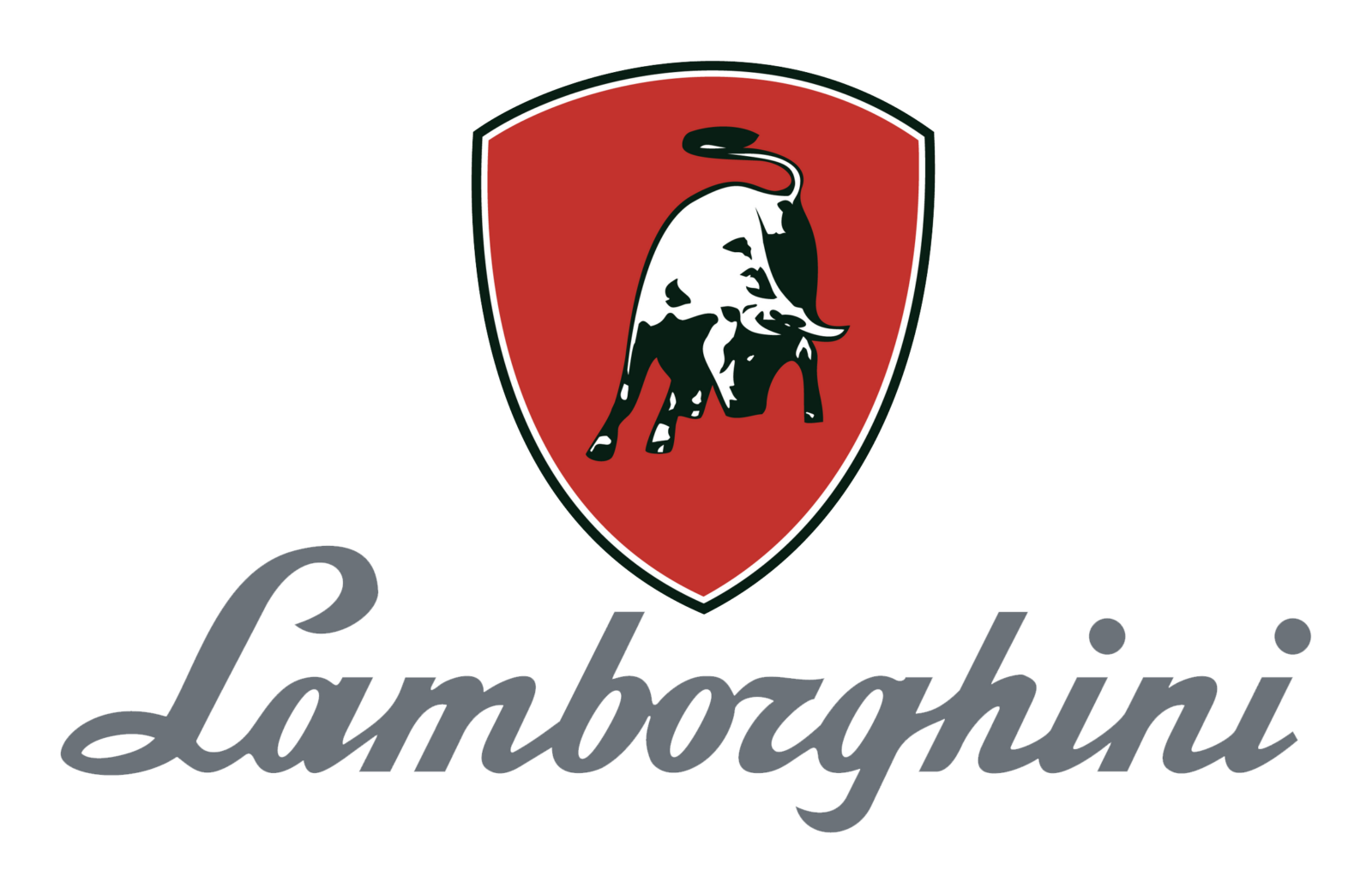
A pivotal transition for Lamborghini, this period marked the company’s foray into sports car manufacturing. The logo was reinvented, taking inspiration from Ferruccio Lamborghini’s visit to the famous Sevilla ranch in Spain, where he was entranced by the Spanish fighting bulls. The resulting design featured a bold, golden silhouette of a raging bull encased in a black shield. This was a defining moment that firmly established the brand’s identity, symbolizing its commitment to power, speed, and luxury.
1972 – 1974
During this brief phase, the Lamborghini logo underwent nuanced refinements, keeping the core elements intact. These alterations focused on enhancing the shading and definition of the bull, imparting a touch more realism and vibrancy to its appearance. The adjustments were subtle, retaining the familiar imagery while freshening up the logo’s visual appeal.
1974 – 1998

These years were marked by incremental changes to the logo’s design, matching the aesthetic sensibilities of the times. The once robust silhouette of the bull was streamlined, and the shield’s hard edges softened to give it a sleeker look. These updates were aimed at modernizing the emblem without losing its original essence and connection to the brand’s heritage.
1998 – Today
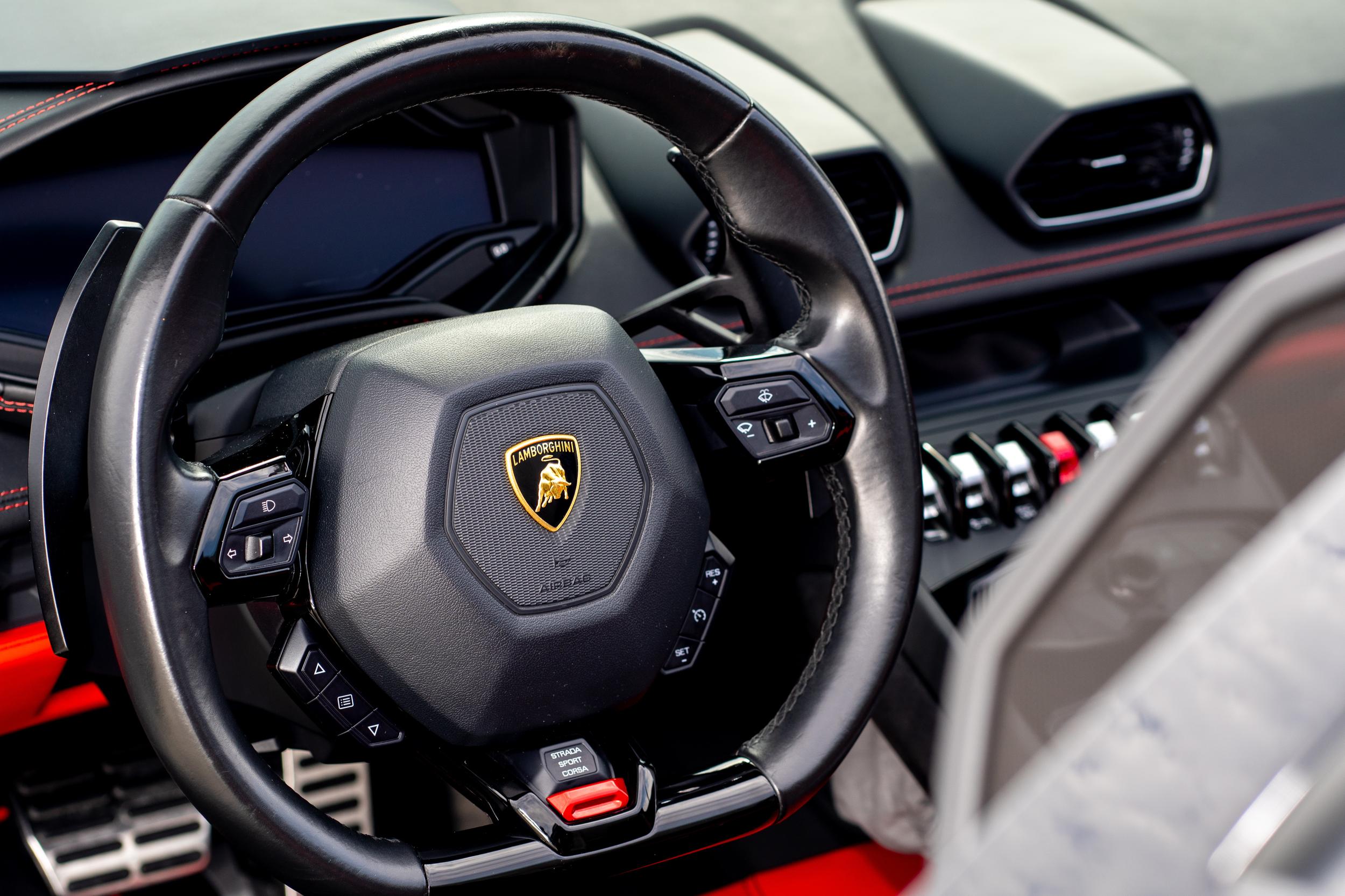
The contemporary era has seen the Lamborghini logo evolve into its current form. The bull, now more stylized and imposing, dominates the shield with a bold golden hue, set against a contrasting black backdrop. This rendition marries tradition with a modern aesthetic, creating an emblem that stands for both the history and the forward-thinking nature of Lamborghini.
Lamborghini Symbol Font and Colors
The Lamborghini logo’s font and color scheme are a significant aspect of the brand’s visual identity, meticulously chosen to convey specific attributes and values.
Font
The font used in the Lamborghini logo is strong, elegant, and custom-crafted to reflect the brand’s exclusive nature. Unlike generic fonts, Lamborghini’s typography is tailored to echo the unique design principles of its vehicles. The letters, though simplistic in form, carry a certain weight that conveys the robustness and solidity synonymous with the cars themselves. The typography is refined and sophisticated, yet powerful, aligning seamlessly with the brand’s luxurious and performance-driven image.
Colors
The color scheme in Lamborghini’s logo plays an equally vital role in defining its visual presence. The dominant black in the shield symbolizes power, elegance, and the mysterious allure of the unknown. It sets a profound and serious tone, resonating with the brand’s image as a maker of superior, high-performance automobiles.
Contrasting the black, the golden elements in the logo, including the bull and the lettering, imbue the symbol with a sense of luxury, quality, and prestige. Gold is often associated with achievement, success, and quality, attributes that align perfectly with what Lamborghini represents.
This deliberate combination of black and gold is not just an aesthetic choice but a carefully considered decision that reflects the essence of Lamborghini. The color scheme creates a harmonious balance that portrays the brand’s character as both a creator of luxurious, elite vehicles and a relentless innovator in automotive design and engineering.
Conclusion
The history of Lamborghini’s logo is a fascinating journey, reflecting the brand’s evolution from its early days in tractor manufacturing to its status as a leading producer of high-performance sports cars. The choice of the bull symbol, the careful alterations over the years, and the selected font and colors all weave a story of a brand committed to excellence and distinction. For car enthusiasts, the Lamborghini logo is more than just a visual mark; it is an emblem of a relentless pursuit of innovation, design, and automotive mastery.

