A Broader Bull, a Bolder Typeface, and the First Refresh Since the Early 2000s
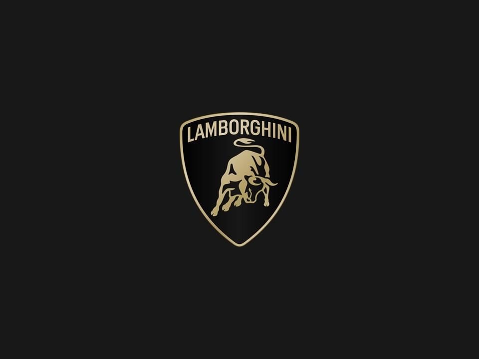
Automobili Lamborghini updated its corporate logo for the first time in over two decades, redesigning the charging bull, the surrounding shield, and the brand’s entire visual system. Placed side by side with its predecessor, the new emblem reveals a distinctly different posture, even if a casual glance might not register the changes at all.
The redesigned logo incorporates a broader Lamborghini typeface with wider letterforms that carry more visual weight. Black and white remain the primary colors, while yellow and a new gold shade serve as accents. The bull keeps its iconic charging stance, but Lamborghini says the rendering drops the three-dimensional, beveled treatment of the old badge in favor of a flatter, more graphic approach, mirroring a broader industry trend toward simplified marks that reproduce cleanly at any scale, from a phone screen to a building facade.
The more consequential move is structural. For the first time, the iconic bull emblem will appear independently on digital platforms, separated from the classic shield. That means the bull can function as a standalone icon in app interfaces, social media profiles, and digital configurators without the full heraldic surround. An exclusive Automobili Lamborghini typeface has also been developed, designed to reflect the distinctive lines and angularity of its vehicles, and a new suite of icons, co-created with Lamborghini Centro Stile, will ensure consistent branding across digital platforms.
Why Now: The Cor Tauri Strategy Behind the Visual Overhaul
A logo refresh on its own would be marketing housekeeping. Lamborghini is framing this one as something more deliberate: a visual component of its Direzione Cor Tauri strategy, the company’s roadmap toward sustainability and decarbonization first announced in May 2021. “Cor Tauri” translates to “heart of the bull” and also names the brightest star in the Taurus constellation, a piece of wordplay connecting Ferruccio Lamborghini‘s zodiac sign to the brand’s forward trajectory.
The company says the refresh aligns its visual identity with values it describes as brave, unexpected, and authentic. Strip away the corporate language and the practical logic becomes clear: the entire product lineup has transitioned to hybrid power. The Revuelto replaced the Aventador with a V12 plug-in hybrid architecture. The Temerario brings a twin-turbo V8 hybrid to the mid-range. The Urus SE electrified the SUV. Every car in the current showroom carries a battery and electric motors. A brand identity designed in the early 2000s, when the Murciélago was the flagship and digital presence meant a website, needed updating to match a company that now lives as much on screens as on roads.
Lamborghini confirms the new logo will be featured on its future vehicles, meaning the cars rolling off the Sant’Agata Bolognese line from this point forward will carry the refreshed badge. For current owners, nothing changes on cars already delivered.
The Standalone Bull: A Digital-First Decision with Physical Consequences
Liberating the bull from the shield sounds like a small graphic design choice, but it carries real strategic weight. In a digital environment where brand marks appear as tiny app icons, social avatars, and notification badges, a detailed heraldic shield with fine line work simply does not read well at small sizes. The standalone bull solves that problem while opening the door for more flexible brand expression: in-car infotainment screens, digital key interfaces, smartwatch apps, and the configurator tools buyers use to spec their cars. Centro Stile’s involvement in developing the icon set suggests this was treated as a design project, not just a marketing exercise.
Whether the standalone bull will eventually migrate to physical car badges remains unconfirmed. Lamborghini’s language specifies digital touchpoints, but the visual logic of a cleaner, more graphic mark could easily translate to a simplified rear badge or steering wheel emblem on future models. The company’s Manifesto concept, revealed later in 2025 as a preview of future design DNA, may offer clues about how the refreshed identity influences the cars themselves.

Three variations of the new Lamborghini corporate logo are presented, showcasing different color schemes for branding flexibility. Image: Automobili Lamborghini.
How This Positions Lamborghini Against Ferrari and Porsche
Lamborghini is not the only supercar maker rethinking its visual identity alongside an electrification push, but the timing and scope of this rebrand carry a particular competitive message. Ferrari has kept its prancing horse essentially unchanged while layering hybrid technology into the SF90 and 296 GTB, relying on the badge’s existing equity to bridge the combustion-to-hybrid transition. Porsche similarly refreshed its crest only modestly, treating the visual identity as a constant while the engineering evolved underneath.
Lamborghini chose to synchronize the visual shift with the strategic one. The message to the market, and to a younger generation of buyers who may associate the brand with Instagram culture as much as with Countach posters, is that the company considers this a genuine new chapter rather than a gradual evolution. One report values the Lamborghini brand at over €20 billion, a figure that, if accurate, would surpass Ferrari’s valuation. Protecting and growing that brand equity through a period of powertrain upheaval is not a trivial concern.
For buyers on the Revuelto or Temerario waiting list, the practical takeaway is straightforward: the cars you receive will carry the new badge, and the digital ecosystem around ownership, from the app to the configurator to the dealer experience, will reflect the updated visual language. The cars themselves remain mechanically identical regardless of which badge sits on the hood.

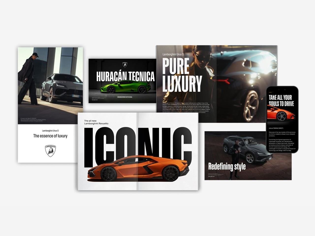
A collection of Lamborghini marketing materials demonstrates the new corporate look across diverse models and campaign themes. Image: Automobili Lamborghini.
Enthusiast Reactions and the Weight of a Six-Decade Symbol
Initial reactions from online commentators indicate a mixed reception, with some expressing dissatisfaction and others finding the differences so subtle they question the purpose of the exercise entirely. Design communities split along predictable lines: purists see the flattened treatment as another casualty of the industry-wide trend toward simplified corporate marks, the same trajectory that stripped depth from the logos of Peugeot, BMW, and Volkswagen in recent years. As Road & Track noted when the badge was revealed, the logo itself is not all that different, even as it represents a genuine strategic pivot.
The bull’s origin story adds weight to any change, however incremental. Ferruccio Lamborghini, born under Taurus, chose the charging bull after visiting a fighting-bull ranch in Seville. That symbol connected the company to its founder’s personality from the very first 350 GT in 1963. Every revision since, from the gold-on-black palette adopted in 1972 to the three-dimensional rendering of the late 1990s, refined the execution without altering the fundamental idea. This latest update follows the same philosophy: evolution, not revolution.
The real test will come when the refreshed identity appears on a car that does not yet exist: the fully electric Lamborghini expected in the second half of this decade. A battery-powered Lamborghini wearing a reimagined bull will be the moment this rebrand either validates itself or invites a harder round of scrutiny. Until then, the new logo is a calculated bet that the brand’s visual language can mature alongside its powertrains without losing the aggression that made the bull iconic in the first place.
Gallery